Learning About Color
Color is totally perceptive, and color preference is subjective, so it can be tricky to decide what colors to use in your home. Read up on the basics of color schemes and palettes to help guide your design.
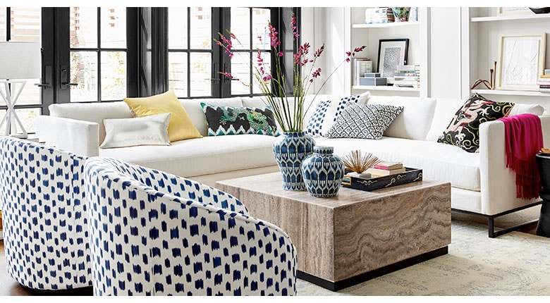
Color has the power to calm, comfort, energize, and inspire, it is one of the most powerful elements of design. The tricky thing is that every human being sees color differently. What you see is not necessarily what your friends and family sees: It’s totally perceptive. Ultimately, you should make decisions about color in your home based on your personal tastes (and your family’s tastes). Read on to learn how to navigate the tricky world of color in interior design.

Color Harmony
Harmony can be defined as a pleasing arrangement of parts, and in visual experiences, harmony is something that is pleasing to the eye. It engages the viewer, creating an inner sense of order and a sense of balance in the visual experience. When something is not harmonic it’s either boring or chaotic. At one extreme is a visual experience that is so bland and boring that we are not engaged. At the other extreme is a visual experience that is so overdone, so chaotic, that we can’t stand to look at it. The key to using color effectively in interior design is to find that happy medium.
There are some basic color palette formulas and color schemes to help us achieve harmony in your interior design.

Analogous Colors
The theory of analogous colors refers to any three colors that are side-by-side in a 12-part color wheel (such as green, yellow-green and yellow). With analogous colors, usually one of the three colors dominates the other two.

Complementary Colors
The theory of complementary color is that any two colors that are directly opposite each other on the color wheel—such as purple and yellow or red and green—complement each other.

Color Schemes
When devising color schemes for your interior design, there are a number of core tenets you should be familiar with, as well.

Triadic Color Schemes
One of these is called triadic color schemes. These are achieved when an equilateral or an isosceles triangle is placed in the center of the color wheel. The three colors touched by the triangle points at once create a harmonious color theme. They are lively and contrasting and provide the strongest contrast in terms of hue. Contrasts are the key to making art and decorating visually interesting. The triangles may be rotated at will, with each resulting three colors creating new harmonious triadic color schemes.

Tetrad Color Schemes
Another is tetrad color schemes. When placing a square or rectangle in the center of the color wheel, the four colors touched by the four corners at once are known as tetrad colors. These four color combinations also create a harmonious color theme. The squares and rectangles may be rotated at will with each resulting four colors creating new harmonious triadic change to quadratic color schemes.

Monochromatic Color Schemes
Another common color scheme is a monochromatic color scheme. This is a one-color scheme. Though it has just one color, it uses variations of that color by adding white or black or by adding a touch of that color’s complement.
In interior design, three different tones of a color is a workable number to use in a space: deep colored areas, mid-tones, and highlights. The higher the contrast between the tones, the more energy you create in a room; the more subtle the differences in the tones, the more subdued the mood of the room becomes.

The Emotional Aspect of Color
Colors can be classified as warm, cool, or neutral. The type of “feeling” the client is trying to achieve can be helped with color choice. Depending on the types of colors you choose for the walls and furnishings, they can go a long way toward setting the mood and energy level in a room.

Warm Colors
Warm colors, also called “active” colors, create a warm, welcoming atmosphere which invites people to linger. Research has shown that people actually feel warmer in a room painted with yellows, reds, or oranges than they do in a white or blue room. The lighter, pastel shades of warm encourage relaxation, while deep, vibrant colors (like deep mauve and bright yellow) create more of a stimulating, exciting environment.
If you want to make a large room look smaller, cozier, or friendlier, or if you want to brighten up a sunless room, use warm colors. You can also use warm colors to create a warm effect in rooms or climates that are low in temperature.
When planning a warm color scheme, remember that the closer any color is to a warm primary (red or yellow), the stronger it is. Large amounts of such colors can be hard to live with, so it’s best to reserve the stronger colors for accents only.

Cool Colors
On the contrary, cool colors, also called “passive” colors, create a calm atmosphere and make a space feel fresh and restful. Psychologically, the color blue is considered calming, relaxing and serene; It is actually known to bring down blood pressure and slow respiration and heart rate. For this reason, it’s often recommended for bedrooms and bathrooms.
To create a calm atmosphere, or to create a space that feels cooler temperature-wise, use cool colors. One important thing to note is that cool colors always appear farther away than warm ones. Also, if a room faces away from the light, cool colors could look bleak, but rooms that get a lot of natural light can use cool colors without appearing cold.

Neutrals
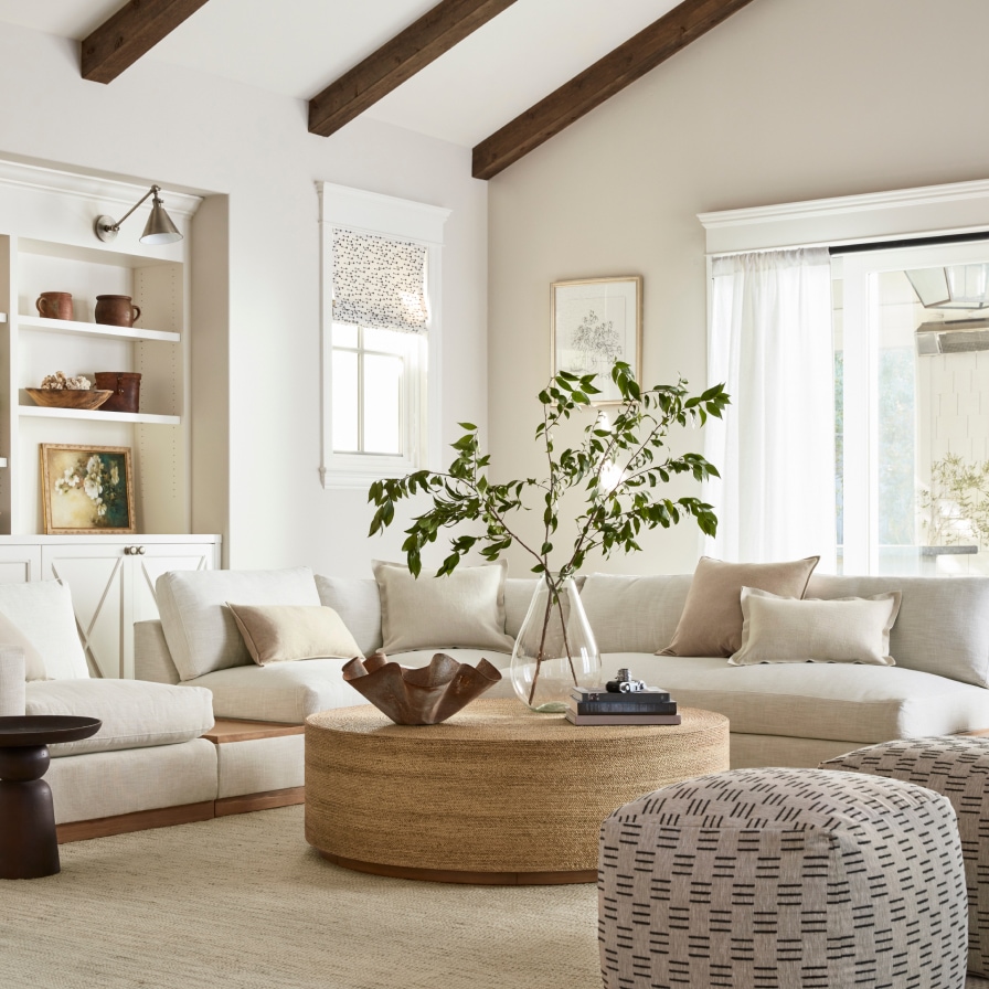
In between warm and cool colors are neutral and earthy colors. These hues are based in nature and evoke a grounded sense of well-being—white, stone, cream, gray, walnut, espresso, and black are all good examples. Neutral schemes are agreeable and easy to live with. What designers would consider “safe,” these tones are the most versatile color choices and create a naturally soothing space with their relaxing effect.
Neutral colors are a great choice if you want to bring a sense of tranquility to a room. You can also use them as a base upon which you layer more intense colors. Or, you can use neutrals on just a single wall to create a quieter effect or lighten a dark room.
Adding touches of warmer neutral hues gives depth to a room; in general, warm neutrals like creams and tans pair well with red and yellow accents. Cooler neutrals like grays and whites are best accented with crisp blues and hues from the cooler end of the palette.

Work with an Interior Designer
Williams Sonoma Home offers free design services to our customers. Work with our stylists and decorators, in your home or at your local store, to create your dream home. Schedule an appointment with the Williams Sonoma Design Crew or work with your local store to get started.


